
A subtle UX gap in a high-frequency workflow
Gmail UX Fix
Pagination
Visibility Issue
Improving inbox navigation by eliminating hidden pagination friction in high-volume email workflows.
A UX teardown focused on reducing interaction friction in one of the most widely used email platforms.
-
Role
Lead Product Designer
-
Timeline
1–2 Days (UX Observation & Solution Design)
-
Focus
UX Audit · Interaction Design · Usability Heuristics
-
Tools
Figma · Heuristic Evaluation
Independent UX observation and redesign concept (not affiliated with Gmail).
Overview
Gmail is one of the most widely used communication platforms globally. While it excels in search and organization, a subtle but impactful usability issue exists in its inbox navigation.
This case study highlights a high-frequency interaction gap affecting users who process large volumes of emails.
Problem Statement
When users scroll through long email lists in the inbox, pagination controls disappear, forcing them to scroll back to the top to navigate further.
Current Experience
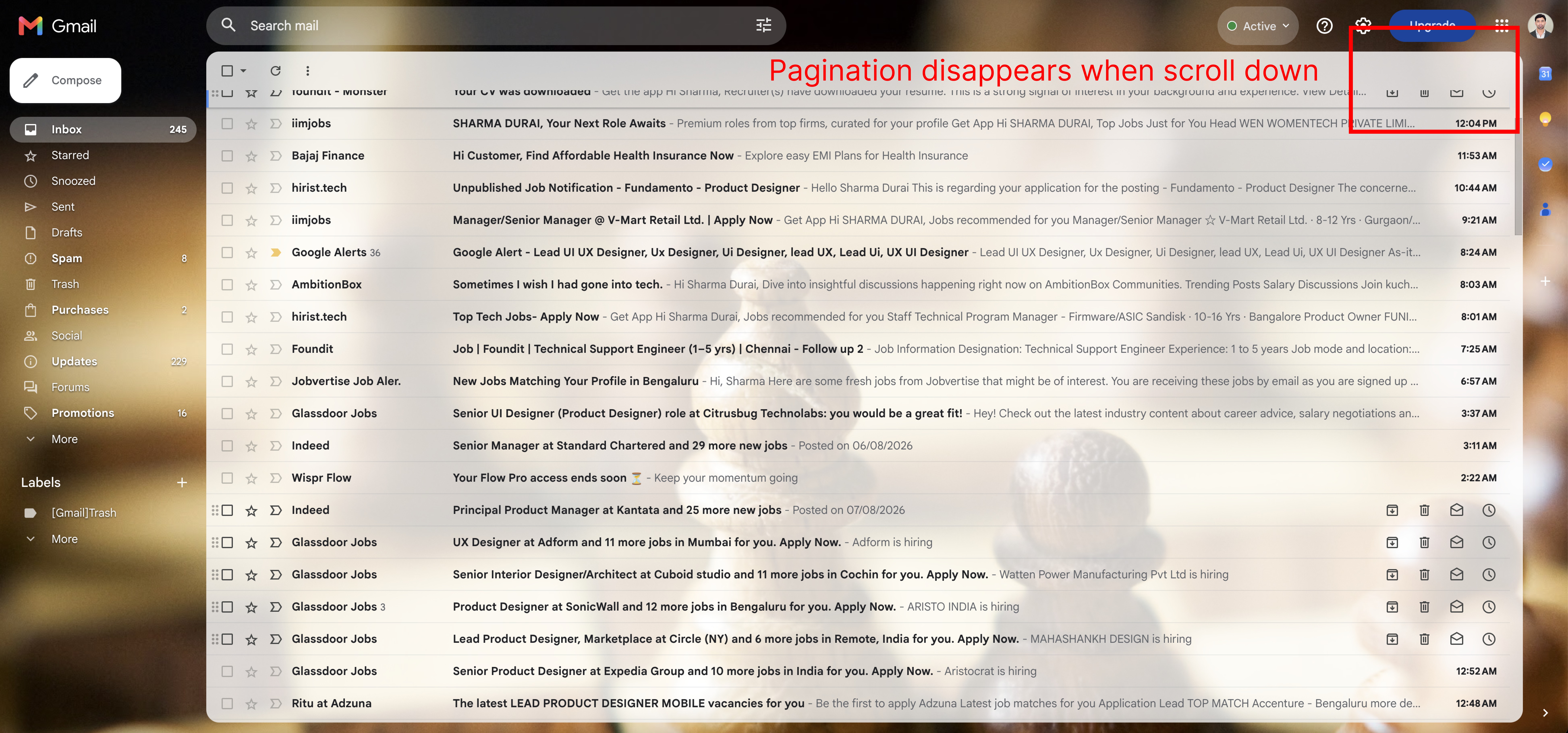
- Pagination (“1–100 of X” + arrows) is placed only at the top
On scroll:
- Controls are no longer visible
- No sticky behavior
- No bottom navigation
- Result → Repeated scroll-back interaction
Why This Is a Problem
Increased Interaction Cost
Users must:
- Scroll ↓ to browse
- Scroll ↑ to navigate
- Repeat
This creates unnecessary effort in a high-frequency task
Broken Workflow Continuity
Email processing is:
- Scan → Decide → Move forward
Instead, users are forced into:
- Scan → Interrupt → Navigate → Resume
Poor Experience for Power Users
Impacts:
- Job seekers managing applications
- Recruiters scanning candidates
- Support teams handling high-volume inboxes
Key Insight
Gmail is optimized for search-based retrieval, but not for sequential browsing workflowsThis creates a gap for users who rely on linear navigation across large datasets
Proposed Solutions
Sticky Pagination (Recommended)
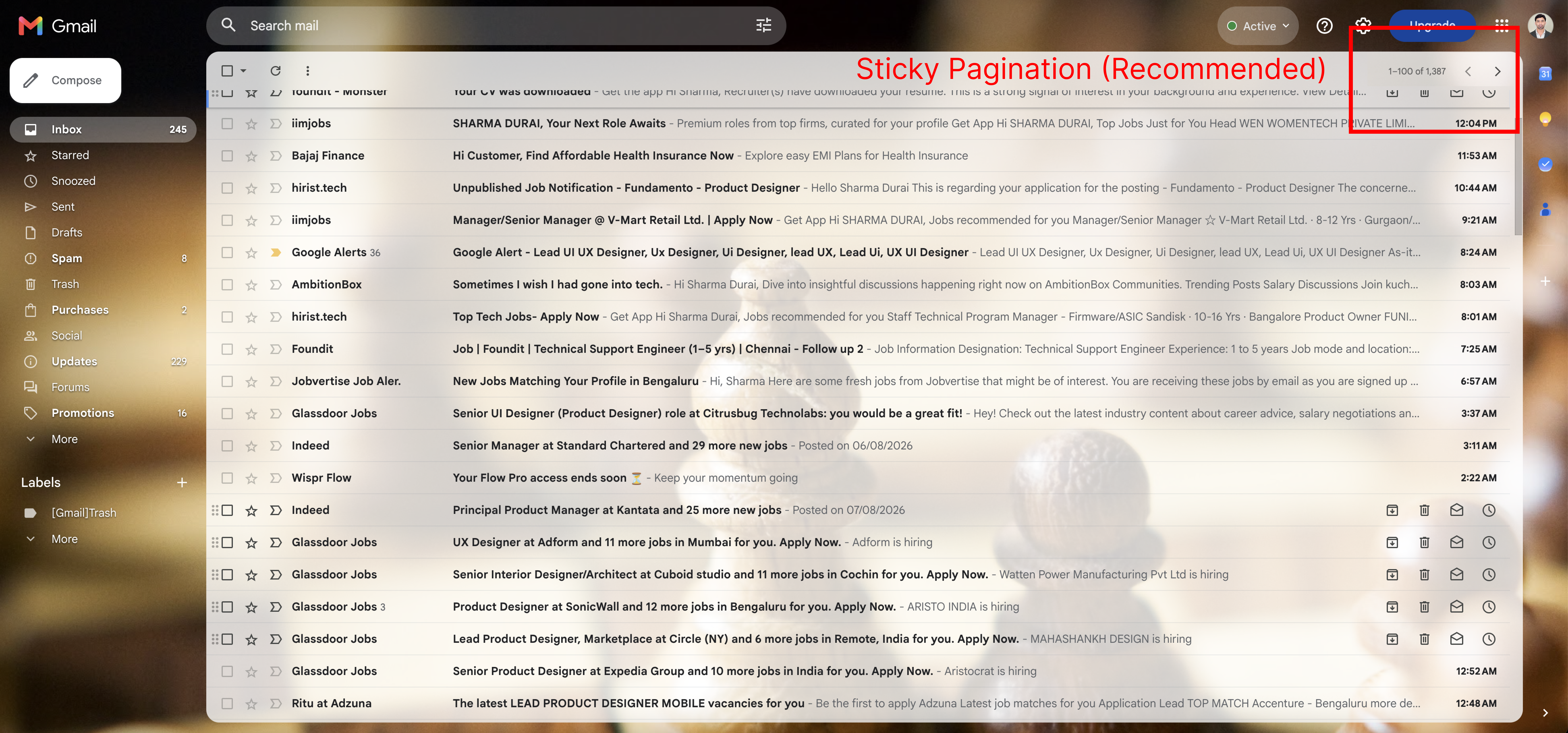
What changes:
- Pagination remains visible while scrolling
Why it works:
- Eliminates scroll-back friction
- Maintains context
- Minimal UI change
Bottom Pagination
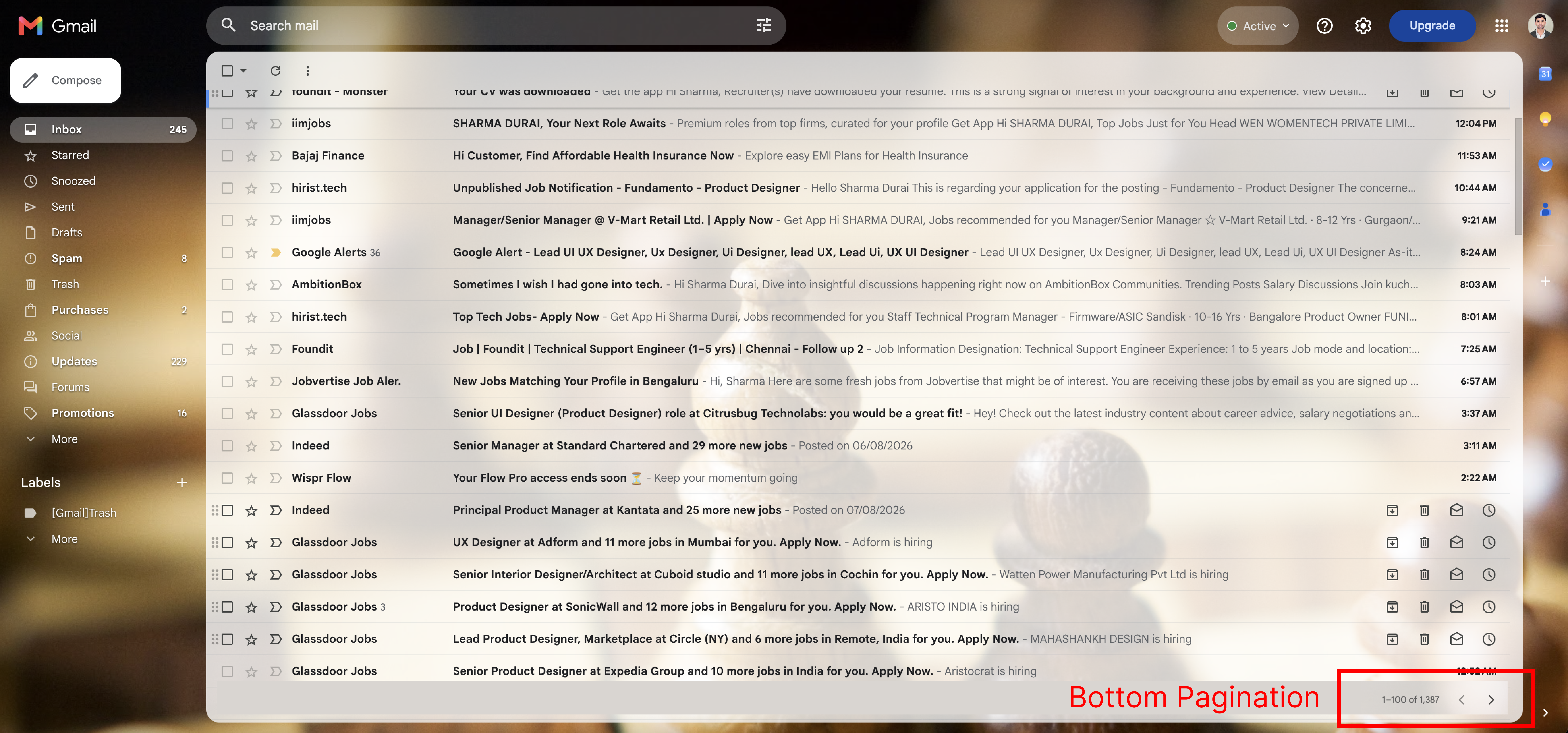
What changes:
- Duplicate navigation controls at the end of the list
Why it works:
- Matches established UX patterns
- Reduces navigation effort
Expected Impact
- Reduce interaction steps by 30–40%
- Faster email processing
- Improved usability for high-volume workflows
Validation Plan
- Job seekers
- Recruiters
- Customer support users
Test with:
- Time to navigate between pages
- Scroll effort
- Task completion speed
Measure:
Final Takeaway
Small visibility gaps in critical controls can create disproportionately large friction in everyday workflows.A simple fix like persistent pagination can significantly improve efficiency without redesigning the system.