
Case Study · Accessibility
Breaking the
Language
Lock Problem
— UX Case Study
Designing inclusive experiences for multilingual users in India Uncovering a language inconsistency inside EPFO's digital ecosystem — and what it costs users when it matters most
-
Role
Lead Product Designer
-
Timeline
2-Week Research & Design Sprint
-
Focus
Accessibility · UX Research · Interaction Design
Problem Overview
EPFO looks multilingual — until it matters.
The public website supports Hindi and English with a visible language toggle.
But the moment users log in to actually manage their account, that support disappears entirely.
Problem Statement
Users encounter an inconsistent language experience across EPFO's digital ecosystem: multilingual support exists on the informational landing page but is absent from the transactional Member portal, where the platform's highest-stakes tasks actually happen.Definition — What Is "Language Lock"?
This creates what I identified and named the “Language Lock Problem” — a UX issue where language consistency breaks across critical stages of a user journey, even when multilingual support exists elsewhere in the experience.
Not a complete lack of translation — but a break in consistency across the user journey.
The system appears accessible at entry, but fails at the exact moment users need it most.
This shows up as:
- A public, informational layer that is translated
- A transactional, task-critical layer that isn't
- No consistency in language preference as users move between the two
Language Lock isn't a translation problem — it's a confidence problem. Users aren't just missing words; they're missing the ability to act without fear of making a mistake.
Research: Two Experiences, One Platform
The Landing Page (epfo.gov.in)
Visitors arrive to a bilingual homepage — Hindi and English are both available via a clearly placed toggle in the header. Navigation, announcements, and general information all support the switch.
The Member Portal (unifiedportal-mem.epfindia.gov.in)
Once a user signs in to actually manage their account, the toggle is gone. The only controls available relate to screen-reader access and text size — accessibility features aimed at vision, not language. Every task inside this portal — UAN activation, claim tracking, passbook access, pension applications — runs in a single fixed language, regardless of what the user selected moments earlier on the public site.
The two halves of the same platform send two different signals: one says "we speak your language," the other says nothing about language at all.
Critical Insight
The issue isn't lack of effort — it's misplacement.Language support exists where it's visible (the landing page), but disappears where it's critical (transactional flows).
Accessibility was treated as a surface layer, not a system-wide requirement.
Pattern Analysis
Four patterns reveal why this gap exists:
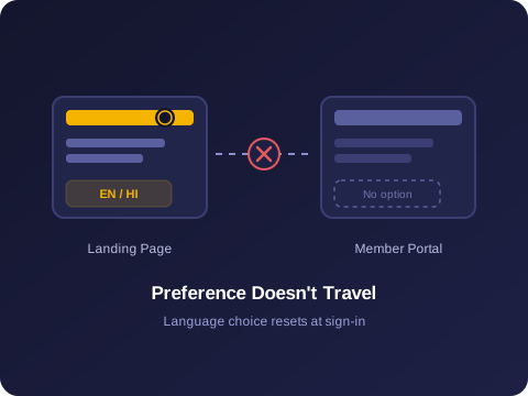
1. Language preference doesn't persist → Selecting Hindi on the landing page has no bearing after login — there's no mechanism carrying that choice into the Member portal.
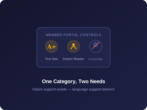
2. Language ≠ Accessibility → The portal's only adaptive controls are text size and screen reader. Language was folded into general accessibility, not addressed on its own.
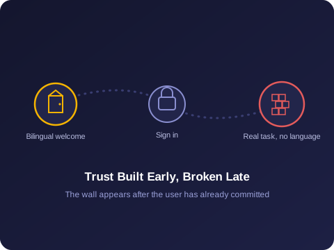
3. Trust is built early, broken late → A bilingual homepage sets an expectation. Users commit to signing in before discovering that expectation doesn't hold.
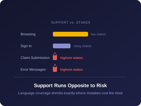
4. Highest-stakes tasks, lowest support → Claim submission, status tracking, error messages — exactly where misunderstanding costs the most — have zero language flexibility.
Core Insight
Accessibility isn't about translating the entry point.It's about sustaining support across the entire journey — especially where decisions carry real consequences.
System Evolution
The system shows clear progress in terms of usability and visual design.
Comparison
- Language options
- Accessibility controls
- Task type
- Consequence of confusion
Landing Page
- Hindi / English toggle
- Standard
- Informational
- Low
Member Portal
- None
- Screen reader, text size only
- Transactional (claims, UAN, pension)
- High
The platform shows real intent toward multilingual accessibility — it simply stops at the threshold where it matters most.
User Impact
This inconsistency shapes real behavior for EPFO's users, many of whom are engaging with the portal for consequential financial matters:- Build initial confidence from the bilingual landing page, then hit unexpected friction after signing in
- Misread or misunderstand critical fields, statuses, or instructions with no language fallback
- Depend on family, employers, or cyber cafés to complete tasks that should be self-serviceable
- Abandon claims or applications rather than risk submitting something they don't fully understand
Why It Matters
For a platform managing provident fund, pension, and insurance for a workforce as large and linguistically diverse as India's, language isn't a cosmetic layer — it's the difference between a user completing a claim independently or not at all.
A bilingual homepage signals inclusion. Without that same support carried into the tasks that actually matter, the signal is incomplete — and the users most likely to be affected are often the ones with the least support elsewhere.
Solution — Closing the Gap, Starting at the Highest Stakes
The solution isn't adding more translation everywhere.
It's closing the gap between expectation and reality — starting with the highest-stakes moments.
1. Carry language preference across the session A user's language choice on the landing page should persist through sign-in and into the Member portal, rather than resetting at the login boundary.
2. Prioritize the highest-stakes screens first Claim submission, status tracking, and error/confirmation messages should be the first targets for translation — these are the moments where misunderstanding carries the most real-world cost.
3. Separate language support from general accessibility controls Language should be its own dedicated control inside the Member portal, distinct from text-size and screen-reader settings, so it doesn't get deprioritized as a subset of a different feature.
4. Apply contextual, not literal, translation Once inside the portal, translated content should reflect how people actually phrase requests and understand confirmations — not a literal, dictionary-accurate conversion that reads as unfamiliar or overly formal.
Outcome
This is an independent research and design audit rather than a commissioned or shipped project, so there's no measured before/after data — the observations here are based directly on comparing the live landing page and Member portal experiences.
What's clear without further testing:
- The inconsistency is verifiable and observable today, by any user who moves from the landing page to sign-in
- The gap sits precisely at the platform's highest-stakes tasks, not its lowest
- Closing it doesn't require reinventing the system — it requires extending a pattern EPFO has already built on the landing page into the portal itself
The natural next step would be usability testing with non-English/Hindi-fluent users inside the actual Member portal, to quantify how much this specific gap affects task completion and claim abandonment.
Opportunity
This finding points to a broader principle for any large-scale platform serving linguistically diverse users:
- Audit language support by task stage, not just by page — a bilingual homepage can mask a monolingual core product
- Treat language preference as session state that persists, not a per-page setting
- Prioritize translation investment by consequence, starting with irreversible or high-stakes actions
- Separate language from general accessibility so it doesn't get deprioritized as a subset of a different feature
Final Thought
A system isn't truly accessible because it offers choice at the start.It's accessible when that choice stays with the user — all the way to the outcome.