
Time to Race
Redesigning the
SAMF Racing
Mobile App
Redesigned the SAMF racing app to simplify navigation, improve content discoverability, and enable real-time engagement for motorsport fans.
A UX case study on modernizing the digital experience for Saudi Arabia's motorsport community
-
Role
Lead UI/UX Designer
-
Timeline
12 Weeks · 20+ Screens
-
Focus
UX Research · Information Architecture · Visual Design · Prototyping
-
Tools
Figma, Photoshop
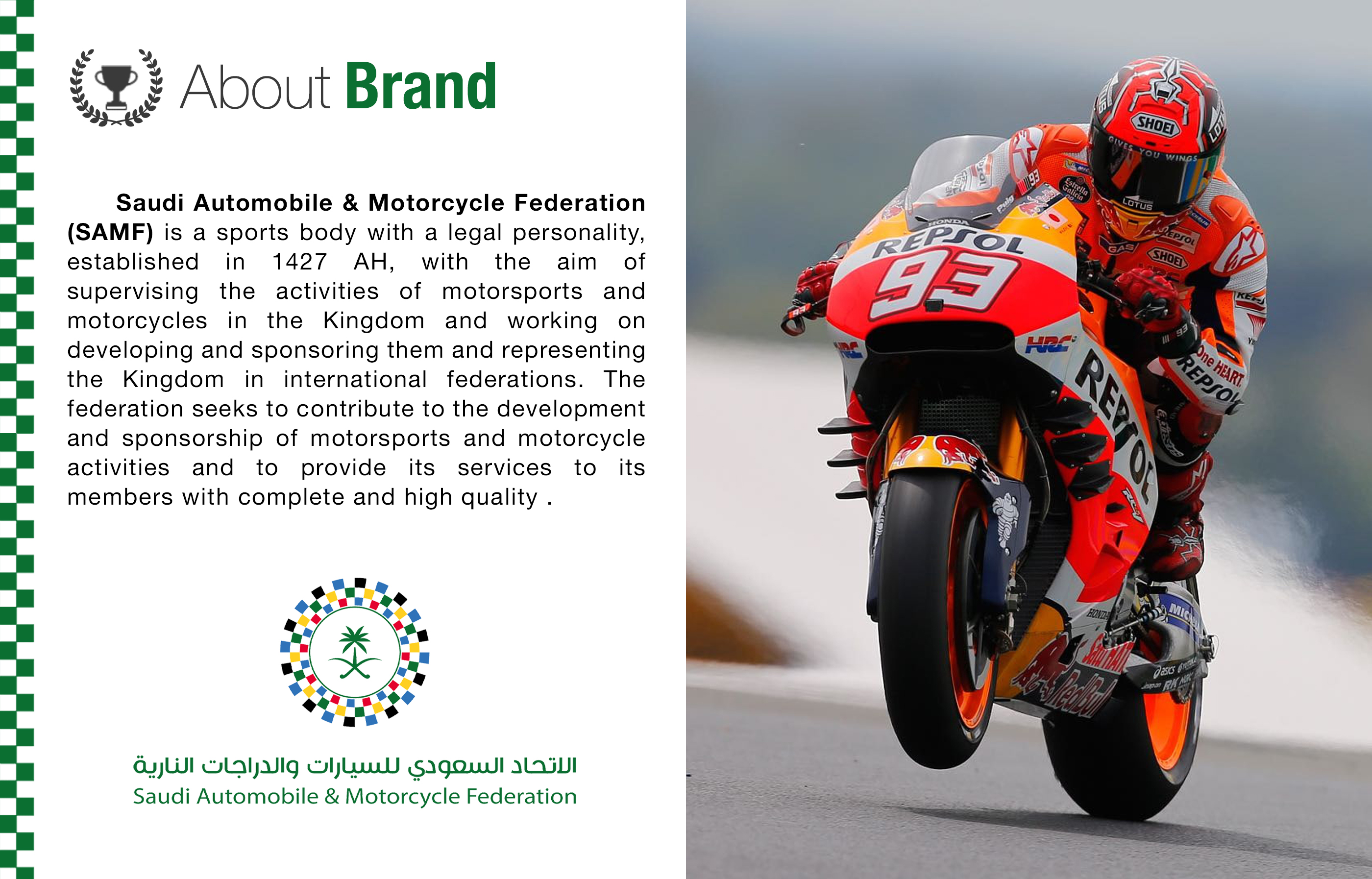
Delivered as part of my role at Sutherland, engaged by SAMF for a Phase 1 UX proof-of-concept.
Overview
This project focuses on improving the user experience of a racing mobile application designed for motorsport fans in Saudi Arabia. The app aims to centralize race updates, driver information, live streaming, and event participation into one platform.
The redesign was approached as a UX enhancement initiative, not a ground-up product build — identifying friction in the current experience and restructuring it for clarity, engagement, and usability.
Problem Statement
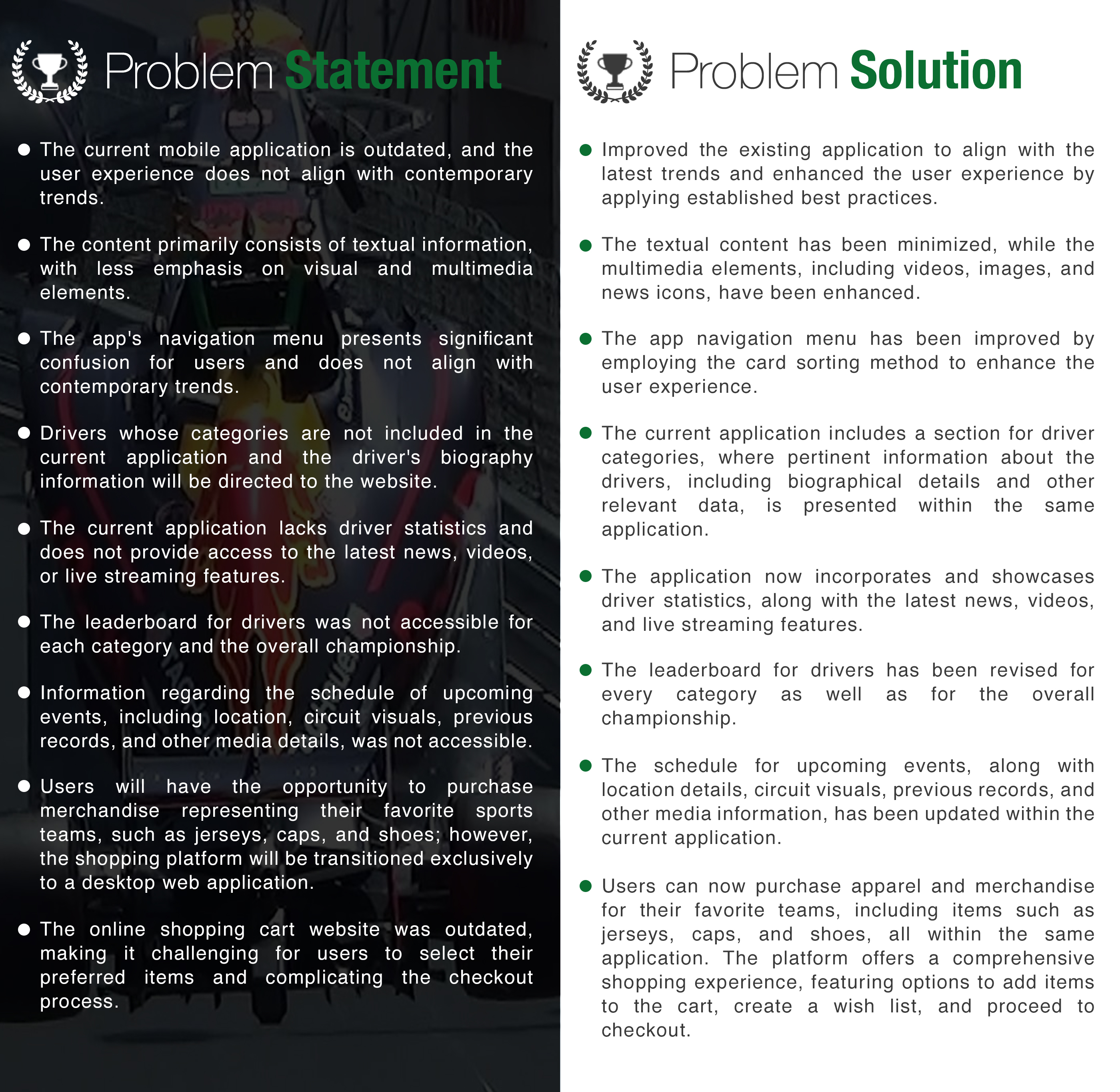
Motorsport fans in the region lack a unified, intuitive digital platform to follow races, explore drivers, and engage with events.
The existing experience showed signs of:
- Fragmented navigation across key features
- Poor content hierarchy
- Limited discoverability of important sections
- Inconsistent interaction patterns
As a result, users struggled to efficiently access information like race schedules, live updates, and driver stats.
Objective
The goal was to enhance usability and engagement by:
- Simplifying navigation across core features
- Structuring content for faster discovery
- Improving clarity in high-traffic sections
- Creating a scalable foundation for future features
Research
User Survey Insights
A survey conducted among motorsport audiences revealed:
- ~70% identified as active sports fans
- ~60% already use mobile apps to follow motorsports
Key expectations:
- Real-time updates
- Easy access to drivers and leaderboards
- Seamless event discovery
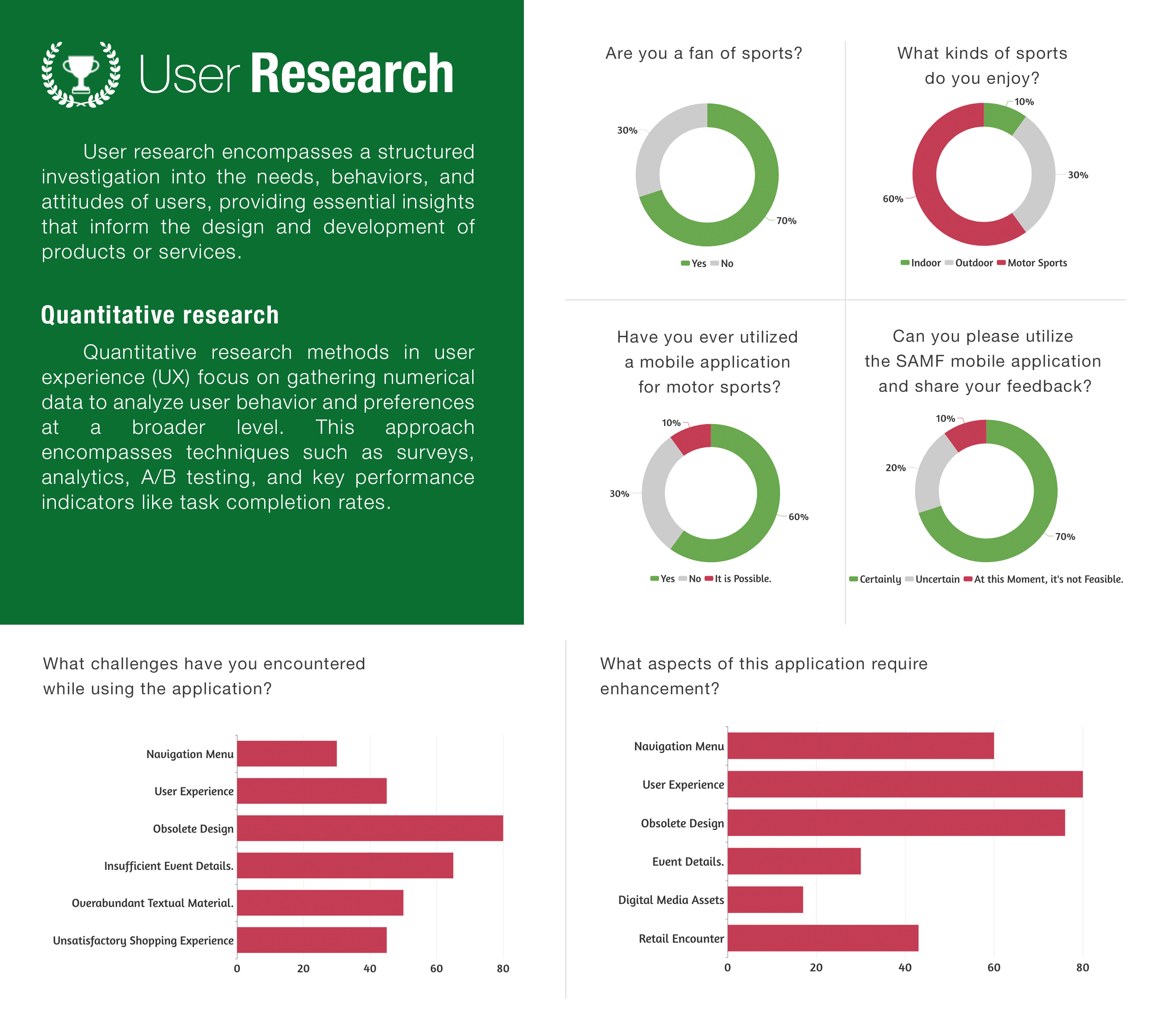
Insight: Majority users rely on mobile apps for real-time race updates, making speed and accessibility critical.
Competitive Analysis
The experience was benchmarked against:
- Yas Marina Circuit
- Dubai Autodrome
- GulfSport
Key findings:
- Competitors emphasized event visibility and booking flows
- Navigation structures were simpler and more predictable
- Content grouping was clearer, especially for races and drivers
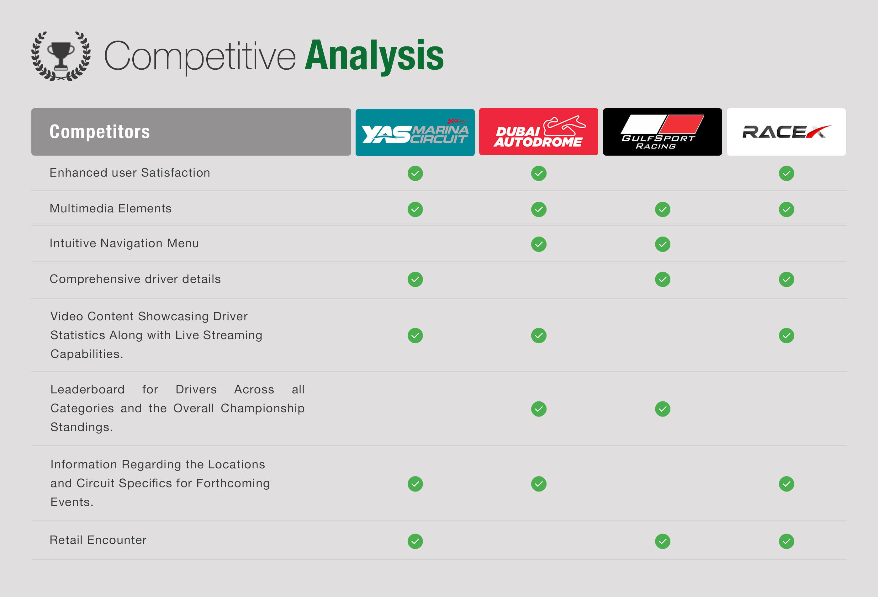
Insight: Competitors simplify navigation and prioritize events, highlighting gaps in the current structure.
Key UX Issues Identified
- Overloaded home screen with weak hierarchy
- Confusing navigation between major sections
- Lack of clear entry points for high-interest features
- Inconsistent labeling and interaction patterns
- Important features buried under multiple steps
Design Process
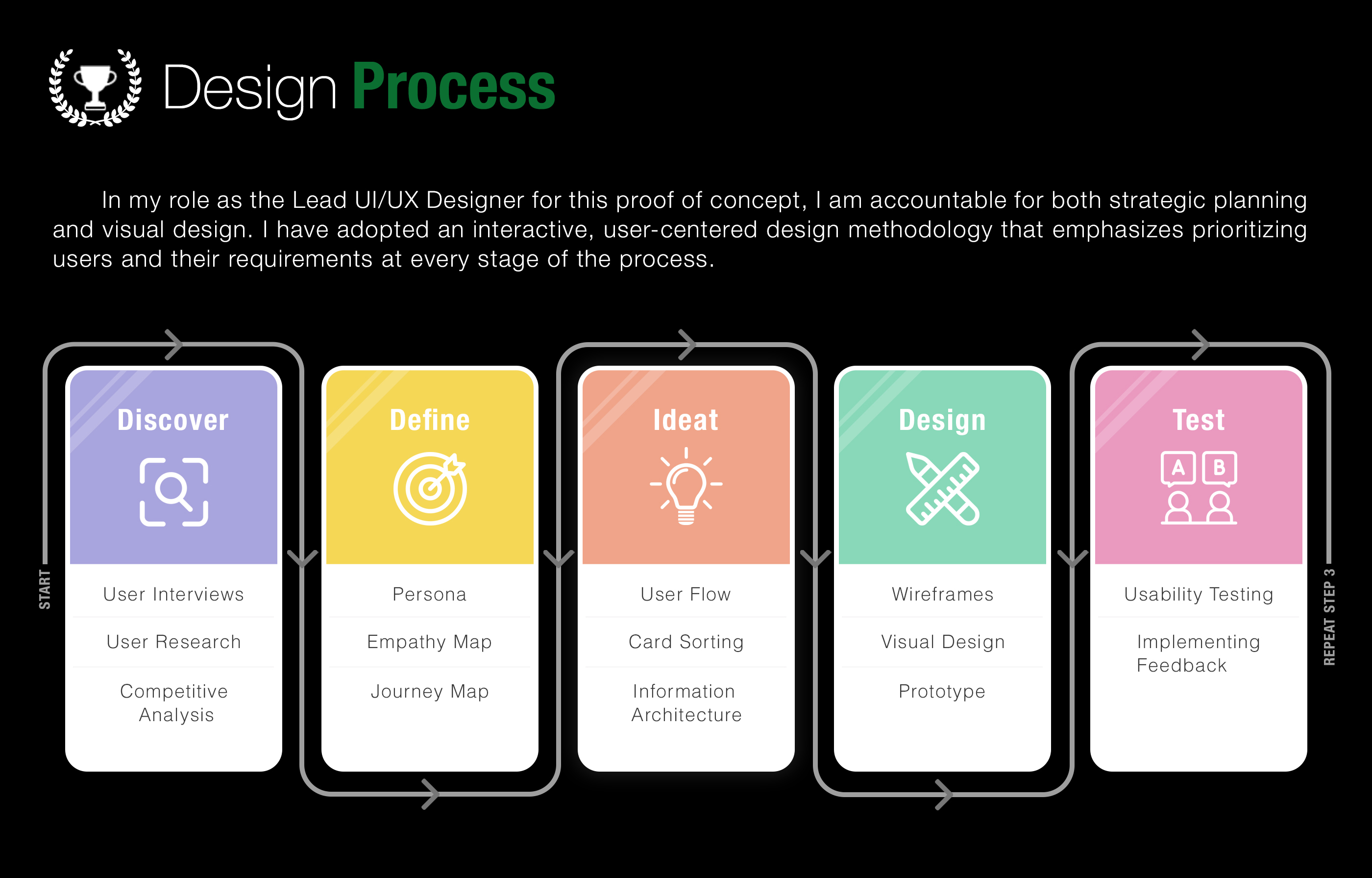
The project followed a five-stage, iterative UX process — Discover, Define, Ideate, Design, Test — looping back to earlier stages as new findings emerged rather than moving through it linearly once.
Problem → user interviews, user research, competitive analysis
Define → personas, empathy mapping, journey mapping
Ideate → user flows, card sorting, information architecture
Design → wireframes, visual design, prototyping
Test → usability testing, implementing feedback
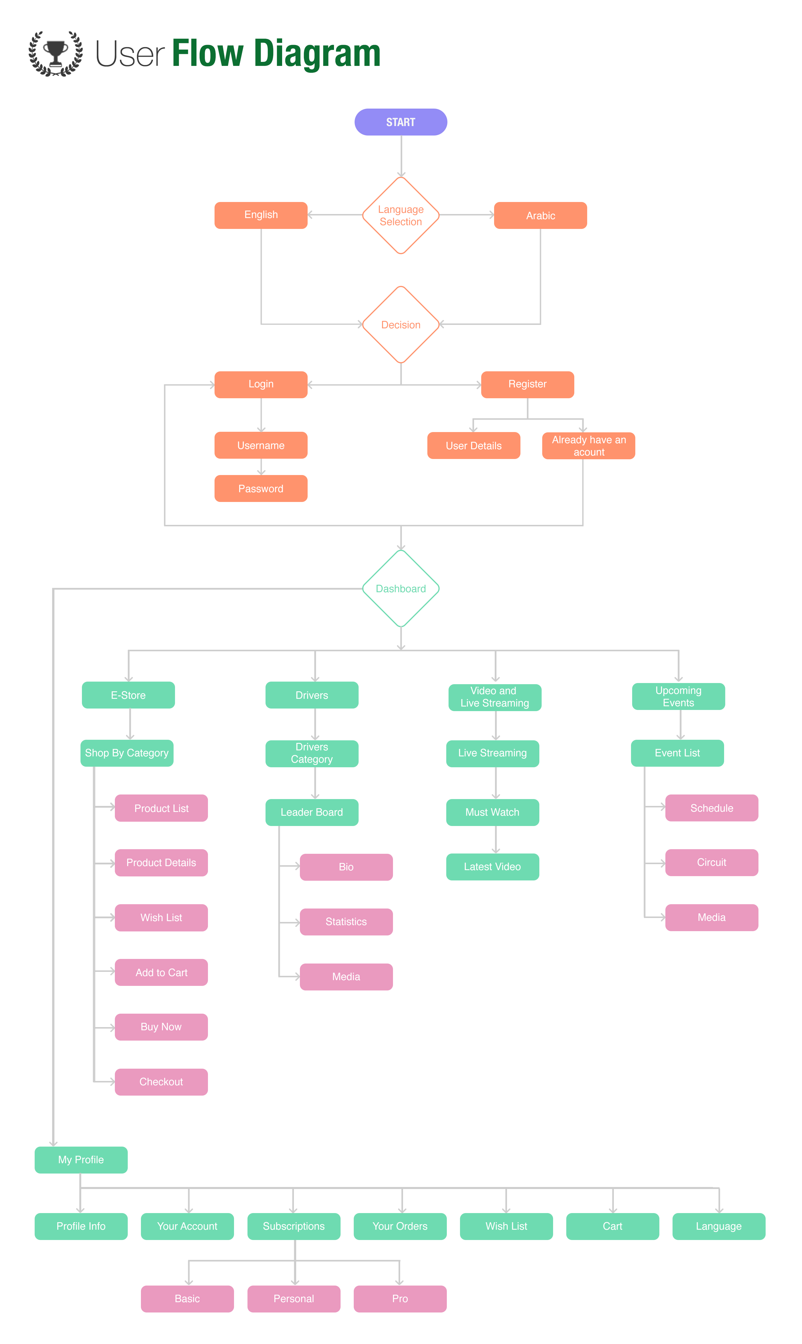
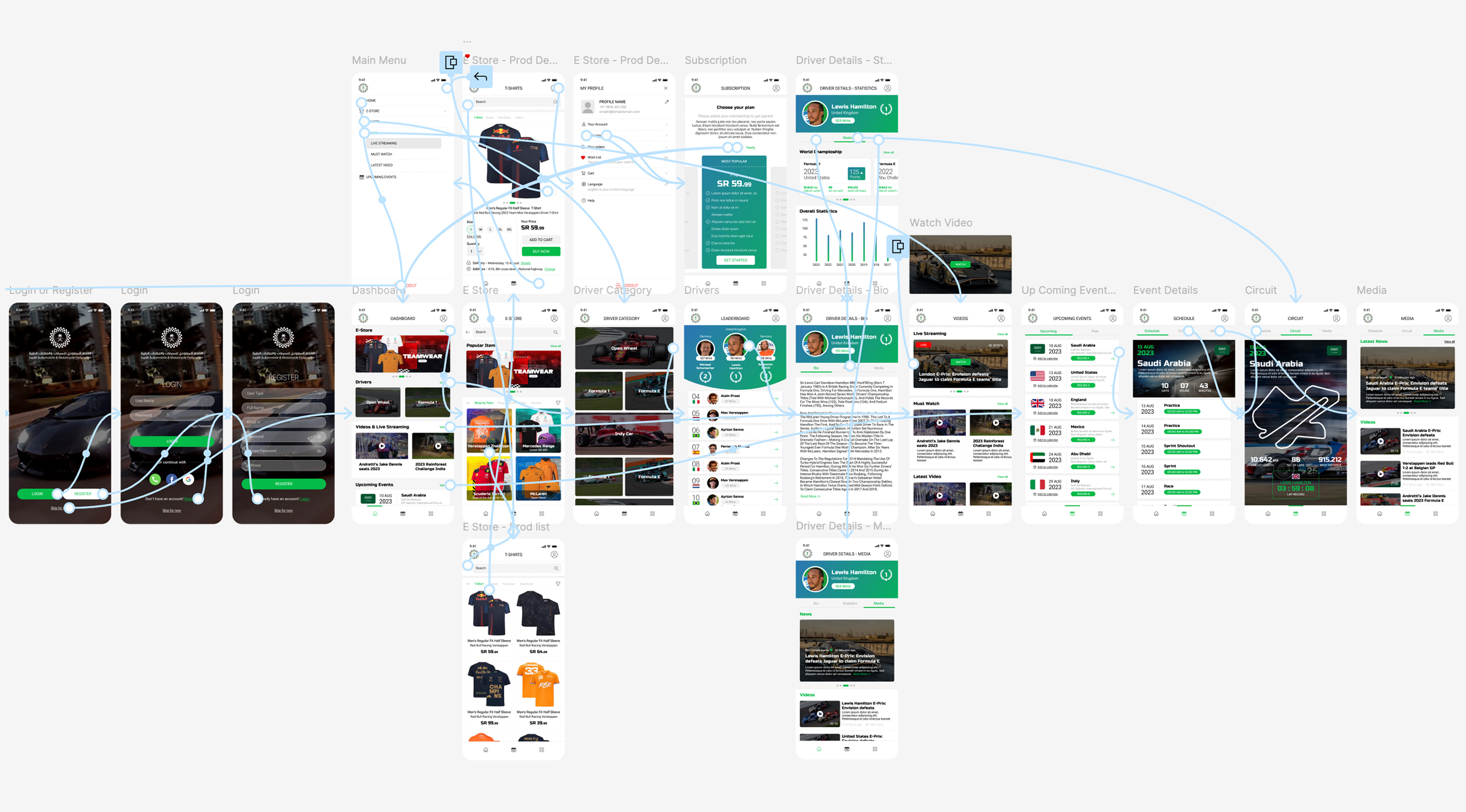
Information Architecture
User Flow
To address structural issues, the app was reorganized into clear, user-focused sections:
- Home
- Events
- Live Streaming
- Drivers
- Leaderboard
- E-Store
This restructuring ensures users can predict where content lives, reducing cognitive load and navigation friction.
Card Sorting Exercise
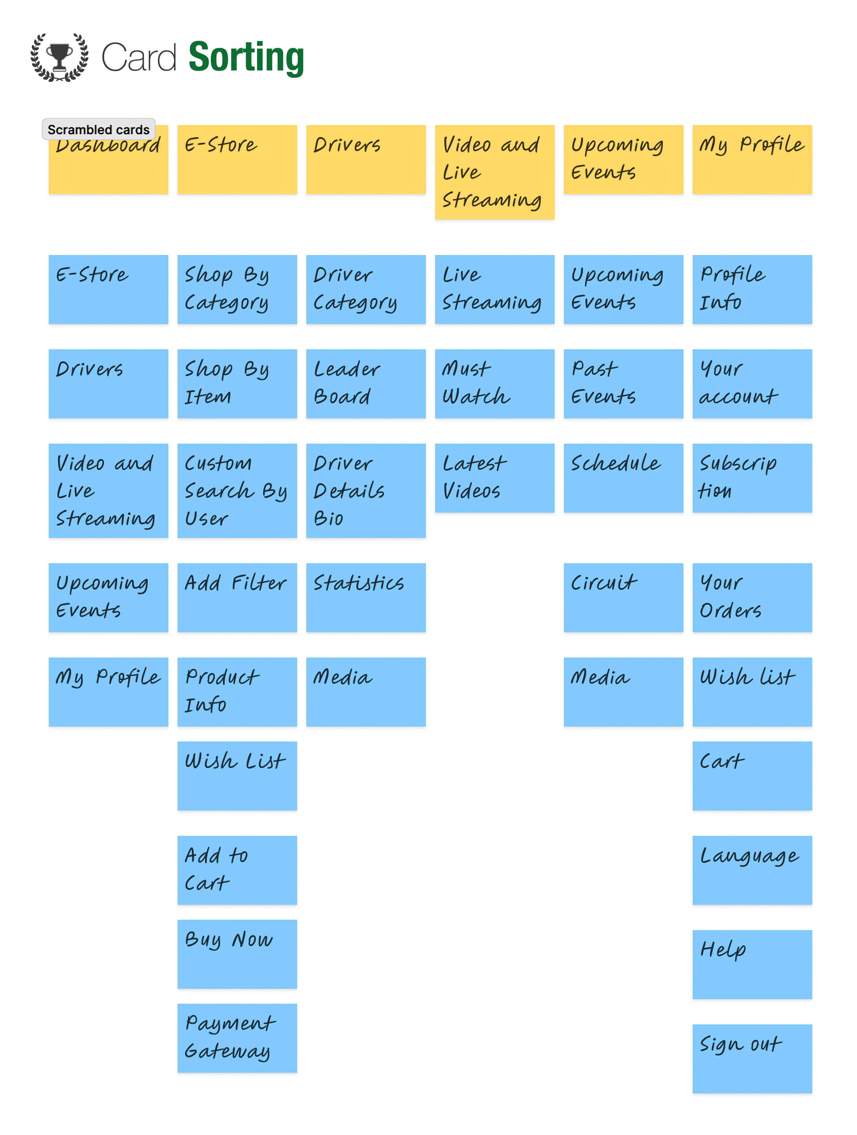
A card sorting exercise was conducted to validate content grouping.
Outcome:
- Users consistently grouped:
- Drivers + Leaderboard together
- Events + Live Streaming closely
- Confirmed need for clear top-level categorization
- Helped refine navigation labels to match user expectations
This restructuring ensures users can predict where content lives, reducing cognitive load and navigation friction.
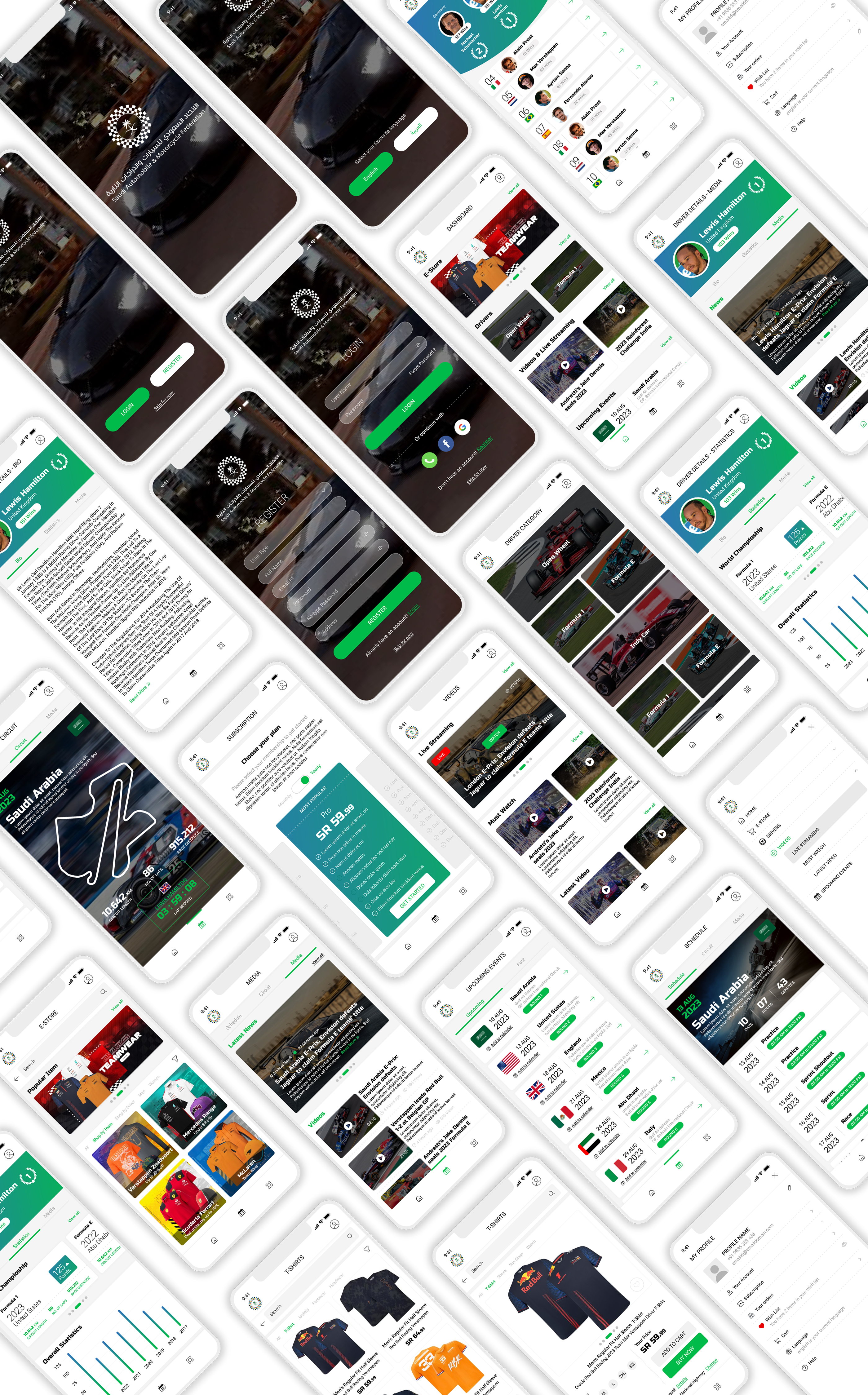
Key Features Redesigned
Drivers
- Structured driver profiles
- Easier access to stats and rankings
Leaderboard
- Clear race standings
- Improved readability and hierarchy
Live Streaming
- Prominent placement for quick access
- Reduced steps to start viewing
Events
- Simplified event discovery
- Clearer event details and structure
E-Store
- Integrated merchandising experience
- Cleaner browsing flow
UX Improvements
- Simplified navigation across all primary features
- Improved content hierarchy for faster scanning
- Reduced interaction steps for key actions
- Consistent UI patterns across screens
- Better alignment with user mental models
Outcome
Visual Design
This redesign improves the product by:
- Making core features easier to find and use
- Reducing confusion in navigation
- Structuring the app for scalability
- Aligning the experience with real user expectations
Rather than relying on assumptions or fabricated metrics, the improvements are grounded in observable UX enhancements and validated research decisions.

My Role & Responsibilities
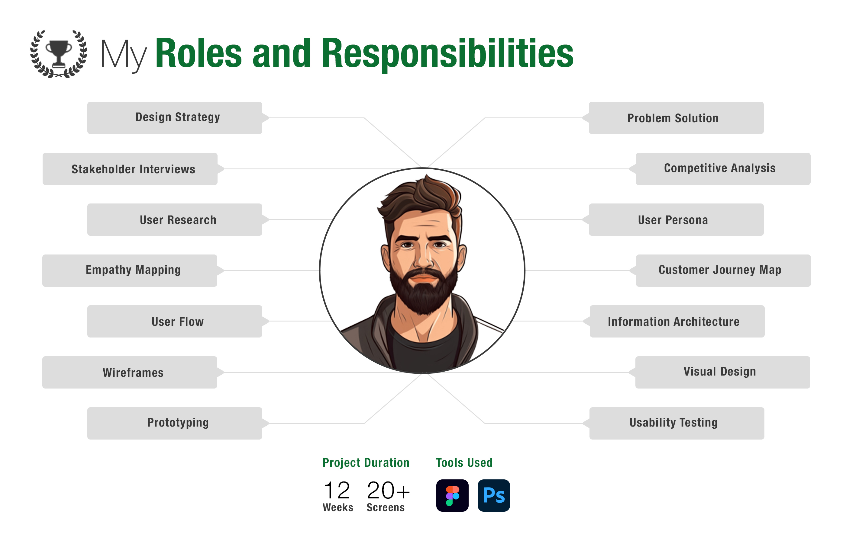
As Lead UI/UX Designer, responsibilities spanned the full process end-to-end: design strategy, stakeholder interviews, user research, empathy mapping, customer journey mapping, user flows, information architecture, wireframes, visual design, prototyping, and usability testing — across a 12-week timeline producing 20+ screens in Figma.
Real-Time Race Mode
A dedicated mode activated during live races that includes:
- Live leaderboard updates and driver position changes
- Lap-by-lap tracking with quick access to race streaming
This transforms the app into a real-time race companion, keeping users continuously engaged without switching between platforms.
Reflection
This project reinforced that:
- Prioritized structure over adding new features
- Simplified navigation to reduce user drop-offs
- Relied on research insights to guide design decisions
Improving core usability has a stronger impact on retention than adding new features.
Impact
- Improved content discoverability
- Reduced navigation friction
- Increased real-time user engagement